When you're placing images you want to think about how people will naturally see it. Notice the Apple home screen has one main picture that grabs attention and one main block of text that is closely associated with the picture. There's no doubt that the cat is a snow leopard. That association gives the OS X version all the attributes of the cat that you see, tough, confident, beautiful, mysterious. Eye flow is hugely important to making text and image work together.
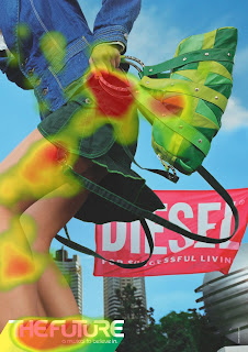
Look at the heat map of this next ad that appeared in print. The purse and skirt get a lot of attention, then the legs of the girl, but there is no attention going to the brand name, Diesel. It's out of the eye flow. The slogan gets a lot of eye time, but the brand gets zero.
When you put your images in to your presentation, most of the eye-time is going to be focused on them. Make them good images that support your message and the point that you're trying to make. When you have text it needs to be in the eye-flow path and it needs to support and be supported by the image.
Look at the sweeping ovals from the Apple homepage. Think about where you would want to put text so that it will be along a line like that. Usually the eye will start in the upper right and move down and to the left, then sweep back up to the right. You want to arrange your images and text to work with this (like Apple did) not against this (like Diesel).
How can you arrange your slide to use eye-flow best?


No comments:
Post a Comment