Find us on Google+
Showing posts with label PowerPoint. Show all posts

Wednesday, February 25, 2015

When to NOT Use PowerPoint

I love visual presentations. Mostly I love them because they offer a much better chance that the audience will retain what has been said. A little effort on the visual side of communication can help cement a message far more effectively than simply speaking alone.

But is PowerPoint (or a similar slide program) the best way to communicate?

That's a great question. It's clear that using visuals that connect with your message in a meaningful way adds to the overall retention and comprehension of your message. It's also clear that when you simply recite words printed on a slide that actually reduces the retention and comprehension of the message (in that case you'd be better off just letting people read for themselves).

But what is less clears is which types of visuals give the strongest boost to retention and comprehension.

Are you ready for this?

It's a whiteboard.

Not slides with bullet points. Not slides with fancy pictures. A simple whiteboard.

Now, not all presentations are conducive to using a whiteboard, but when you can you should probably choose it over a PowerPoint presentation.

According to a recent study, the use of whiteboard illustrations in a presentation were more memorable and more persuasive than either standard PowerPoint presentations or the type of presentation championed by Garr Reynolds in is book Presentation Zen

There are a few things to note about the whiteboard presentation efficacy.

First, the visuals are still key. It's less about writing out what you're saying and more about creating a visual framework for people to use in encoding what you're saying. Draw pictures, relate terms visually, call out what is most important.

Second, the engagement with the message is, in part, due to the perceived participation of the audience in the creation of the presentation. Slides are, of necessity, static, while the whiteboard represents a dynamic space where anything can happen. The audience doesn't know that you have pre-determined what will go on the whiteboard so it feels like they are watching and helping to create the visuals.

Finally, you must rehearse your whiteboard presentation as much, if not more, as your presentation. Static visuals, like through PowerPoint, are easier to use. Giving a whiteboard based presentation takes effort, creativity, fluidity, and a full command of your topic so that you aren't distracted by the details of drawing on the whiteboard in the middle of giving a presentation.

Here are a few tips:


  • Pre-draw your examples to make sure they work. 
  • Use different color pens to indicate topical ideas (e.g. red is always for action, blue is for concepts, black is for side notes). 
  • Create meaning through space. So if you want to show that one idea is central to your theme, put it in the middle of the board and show how all the other ideas radiate out from it. 
  • Less is more. Just as with PowerPoint presentations, don't try to do too much on the whiteboard. Write in large letters so people in the back can easily see. Only put the key concepts on the board. 
  • Don't turn your back to the audience. This seems difficult and it takes some effort to learn to write with your body at a 90-degree angle to the board, but it's important to keep your audience engaged with you. 
  • Move out of the way when you're not writing. Give the whole audience a chance to see the board and to incorporate what you're saying with what they're seeing. 
  • Leave room for spontaneity. One of the best things about the whiteboard is that you can adjust it on the fly based on your audience's reaction to what you've been saying. 
Do you use a whiteboard for any of your presentations? How has it helped you? What would you add to this article?

Friday, May 02, 2014

God in Art or Visio Divina

Rublev's icon depicts the Trinity at a table together.
Art is a powerful communication tool that often transcends words. Luckily God and the bible have inspired art throughout the centuries.

The Orthodox tradition uses icons to help focus prayer through a practice called Visio Divina or "divine seeing." It is a counterpart to the practice of Lectio Divina which uses scripture as a source of meditation and contemplation.

I like connecting the body back to ancient ways of looking at the bible and it's a helpful way to find applicable visuals for preaching through a passage.

For example, recently I preached about the woman caught in adultery in John 8. I found several paintings depicting the scene and was able to use one of them to start some conversation in the church on the topic.

Another benefit to using paintings is that they are often public domain images. When projecting an image in church we need to be aware of the copyright situation and only use works for which we have the copyright. Public domain and creative commons images have an open license that allows you to use them without having to pay royalties. You can also find royalty free stock photos (both free and paid).

You can use Google's Image search to sort the images by license type.

Typically I'll start with Google Images and look for the passage I'm preaching through. Then I'll start to narrow things down by using the name of the pericope (like "woman caught in adultery" rather than just "John 8"). Then I might need to add the word "painting" to the search string to refine the results.

Usually I'll come across a great renaissance painting of the passage that will serve as an illustration for my text. I'll often use this as the title image for my sermon. It give the audience a chance to get into the passage without giving away too much of my sermon.

This image uses dark and light to illustrate the conflict of John 8:1-11
Connecting my preaching with classic paintings helps to keep the visual people connected, reminds the church that we're part of a great cloud of witnesses who have been thinking about these passages for millennia, and gives me high-quality visuals that are public domain for no cost. 

That's pretty cool to me.

Wednesday, April 30, 2014

Simple Visuals

Notice how the text and the image work together to make a point. 
When presenting it can be intimidating to add visuals, especially if you don't know a lot about design. I'm working on my skills, but I'm still far from being a professional. My profession is putting words together, not images, but I can't afford to spend lots of money on design work nor can I afford to ignore the visual aspect of communication.

So, I work from a stance of simplicity.

In many sermons I'll have one slide per major point. I do that so I can still move and flow within the sermon and have something visual to help connect my ideas for the people who learn best that way.

If you're just starting out take your three point sermon and turn it into a five slide deck.

Slide 1: Title Slide - this is the title of your sermon. This slide will be up while you introduce things, read scripture, etc. It should be mostly the title of your sermon and an enticing image that invites people into your text without giving away your point.

Slide 2: Point 1 - This should be a full-bleed image (it takes up the whole slide) with one or two words that define your first point.

Slide 3: Point 2

Slide 4: Point 3

Slide 5: Title Slide - Return to your title slide for your closing remarks (and so you don't have the black screen with "End of Slideshow" at the top). Ideally there should be a sort of ah-ha moment as the image you chose clicks for the audience.

You can find some good sources for images here.

You can find some good tutorials on using PowerPoint here.

Wednesday, January 15, 2014

Google Image Search by License

I'm a fan of using Google Image Search to find pictures for my PowerPoint presentations. But there are legal limits to what I can use -- defined by the license on the photo -- so I need to be careful. For a long time Google just slapped a generic warning on the search results that alerted you to copyright issues. Caveat Emptor, or something like that.

Bing -- Microsoft's most recent search engine attempt to dethrone Google -- has had the ability to search images and filter the results by license since December, but now you can do the same thing in Google.

When you do an image search in Google you can filter the results by clicking on the "Search Tools" button above the results. From there you can filter by image size, color, type, time and now license type.

If you aren't getting paid for the use of the image you can use the least restrictive license type: Labeled for Reuse. From there the restrictions add up, you can have something labeled for reuse with modification, for commercial reuse or for commercial reuse with modification.

So if you want to edit a photo to use in selling your next book, you'll need the images licensed for commercial reuse with modification, but if you're giving a presentation at a non-profit and you don't plan to edit the picture you can use the images licensed for reuse.

Here are some other presentation resources that might be helpful.

Friday, September 13, 2013

What is Happening in the Churches of Christ?

This is a PowerPoint presentation I put together to help explain what's happening in the Churches of Christ based on Joe Beam's article in Grace Centered Magazine.

Let me know what you think. Is he right? Where do you see yourself on this spectrum? What do you see in the future?

Wednesday, August 08, 2012

Powerful Points or PowerPoitnless?

Today I happened across the syllabus for Sermon Development and Delivery at my alma mater, Harding School of Theology in which my friend and former professor Dr. Bland offers one article on the use of PowerPoint in preaching. The article he chose is "PowerPointless" by Debra Dean Murphy in The Christian Century. 

I took a quick read of the article. It's good. It makes some excellent points (that I've made myself) about how PowerPoint can be a detriment to worship and preaching. Murphy starts off by quoting Edward Tufte: "Power corrupts, PowerPoint corrupts absolutely." I think that Tufte brings up needed critiques of, what he calls, "the PowerPoint cognitive style" which is a reduction of ideas to bullet points on a slide. That style of "death by PowerPoint" needs to be rooted out from every classroom, conference room and pulpit. It leads to less understanding of the material by both the presenter and the audience.

So, Murphy is right when she says, "To use PowerPoint in worship is to unwittingly set up a competition between what's projected on the screen and the human voice doing the preaching, praying or singing." When PowerPoint is used in a text-based format, peppering the audience with pithy bullet points that attempt to reduce the irreducible, it is absolutely a competition between voice and screen.

However, Murphy either has never experienced or chooses to ignore the combination of images with speech. Copious neurological research underscores the fact that when the human voice is paired with complimentary images, retention and comprehension of the material rise dramatically.
"If information is presented orally, people remember about 10 percent, tested 72 hours after exposure. That figure goes up to 65 percent if you add a picture."
That's a serious increase, and it's nearly impossible without PowerPoint. You could make your sermon 6.5 times more effective by adding a few pictures. That doesn't seem pointless to me.

Friday, June 22, 2012

Projected Text is Evil

Don't project text in your PowerPoint presentations. It's evil.

Edward Tufte has famously said, "PowerPoint is evil." Which isn't far off the mark. It's kind of like the oft misquoted bible verse, "Money is the root of all evil." Well, it's close, but the actual verse says: "For the love of money is a root of all kinds of evil." The shortened version is close, but misses the real meaning and confuses the point.

I think the same is true of what Tufte said. I don't think PowerPoint is evil (you may have guessed that). But I do think that projecting text is. What's worse is reading the projected text while your audience silently reads the same words. But I'm not the only one who thinks this.

Dr. John Medina, author of Brain Rules, points out that in an oral presentation you can expect the audience to remember about 10% of the material. If you add a picture to the oral presentation, the retention goes up, 6 1/2 times. But, if you put up text while you give the oral presentation, the comprehension and retention drop by about the same amount. So if you project a PowerPoint slide with the same text you're reading to your audience, they'll only take away about 4-6% of it.

It's not PowerPoint that's bad, it's the way people use (i.e. abuse) it that's evil. The neurological research proves it. A projected picture helps, but projected words hurt. If you want your audience to remember anything that you've said, use pictures that support your oral presentation. But, if you want them to promptly forget 96% of everything you said, go ahead and project text.

Edward Tufte would know just what to say.

Monday, March 05, 2012

It's not PowerPoint's Fault!

Over at SlideShare they posted this fantastic presentation on the difference between the tools and the tool-wielder. The premise is that blaming PowerPoint for poor presentations is like blaming a car for an accident. Without the driver, the car wouldn't move an inch. Without a presenter, PowerPoint won't do anything. It's up to the presenter to do their job well, not PowerPoint. And it's the fault of the presenter if the presentation is terrible, not PowerPoint.

I agree completely, it's not right to eschew PowerPoint just because people have made some terrible PowerPoint presentations. For a long time I wouldn't eat ribs because all I'd ever eaten was Tony Roma's sauce-soaked strips of rubber. But then I moved to Memphis and had real barbecue. Juicy, tender meat that falls off the bone and is so flavorful that it doesn't need a sauce at all. If I would have continued in my assumption that I didn't like ribs, then I would have missed out on one of the best things in life.

Memphis style ribs I made.
 I never would have learned how to make my own ribs (and other slow-smoked barbecue), if I would have persisted in the assumption that the problem was with ribs or barbecue. Don't make the same mistake with PowerPoint. It's a tool that can be used to do amazing things, or it can be completely ruined. Don't blame the tool, though. Learn to use it well and you'll be amazed by the results.

Sunday, February 26, 2012

Alternatives to PowerPoint

Today Lifehacker is showing off alternatives to PowerPoint, they asked their readers for the best non-PowerPoint presentation tools and the top five are:

Keynote - you need a Mac to use it. Apple won't even consider releasing this for Windows, which is a pity, because it could be a serious contender with PowerPoint for market share if it could run on 90% of the computers in the world.

Google Docs - I've looked at it before and I looked at it again when they updated things. It still feels like PowerPoint 2003 (or earlier) in terms of the capabilities and layout. The one advantage is the tightly integrated collaboration that is in all of Google Docs. You'll need to do all of your photo editing outside of the program and but you can create adequate presentations in the cloud.

Beamer (LaTeX) - I tried to do anything with this, but it is beyond my skills. Basically you code your presentation from scratch. It gives you a lot of flexibility, but the learning curve is immense. If you already know LaTeX, then this is for you, if not, steer clear.

Prezi - This is the one, truly different choice that made the list. It doesn't function in a linear, slide-based setting like PowerPoint (or the other programs) rather you have a large canvas on which you can place all of your images and text. Then you navigate around through the presentation by zooming, rotating and swooping around the canvas on a pre-defined course. When viewed it looks organic and natural, but the actual presentation design needs to be, if anything, more linear and pre-planned than the slide-deck variety.

OpenOffice.org (or LibreOffice) - Pretty much just the free, open-source version of PowerPoint. You can open and edit PowerPoint files and do most of what you can do in the Microsoft software. Like Google Docs, it's behind the times as far as cutting-edge features, but it's a good (and cheap) alternative if you need something for your next presentation.

What PowerPoint alternative do you use (and why)?

My vote was, and still is, for the good, old whiteboard.

Friday, February 24, 2012

PowerPoint Screenshots and Screenclips


The original image.
If you've ever found yourself in dire need of an image, either from a website or to show something on your computer, the PowerPoint screen shot and screen clip tool is what you've been waiting for. It used to be that you would have to press the Print Screen button on your keyboard to get a snapshot of everything on your computer's monitor, then you could paste that image into a program (like PowerPoint) and crop out all the bits you don't want to show. But now with Screen Clipping, you can simplify all that into one step, and I love it.

You can find the Screen Clipping option on the Insert tab of PowerPoint 2010. Click "Screenshot" and then at the bottom of the window that pops up, click, "Screen Clipping." Your screen will get all washed out and PowerPoint will minimize. When you see a black cross, you can click and drag on your screen to define the area you want inserted into your PowerPoint presentation. It's that simple.

My screen clipping
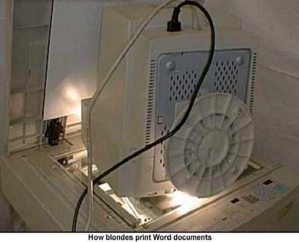
I was able to crop the top photo into the bottom photo in a few seconds (I removed the blonde joke).

You're not just limited to using the images in PowerPoint, either. You can quickly grab screen clips and then save them on your computer to use elsewhere (like a blog, for example). Once you're done clipping, just right-click the image in PowerPoint and choose "Save as Picture." Choose a location and enter a name to save the clip. This is a quick way to generate a lot of clips with very little effort. Even if you're not creating a PowerPoint slideshow, it's still one of the fastest tools out there for getting the clips and saving them as images.

If you want to take a screenshot of a whole window, just click on the "Screenshot button and then click on the thumbnail for the window you want to grab. PowerPoint will insert an image of that entire window on the active slide.

What screen clipping and screen shot tips do you have?

Wednesday, February 22, 2012

How to Turn a PowerPoint Presentation into a Video

Recently I've put a few of my PowerPoint presentations online. It used to be that the best way to do this was though sites like SlideShare or other similar sites. But with the new 2010 version of PowerPoint you can save your slideshow as a video that can then be uploaded to YouTube (or any other video sharing site).

The basic process is simple. You click on the "File" tab in PowerPoint 2010 and then click "Save and Send" from the list of option. Click "Create Video" under File Types and then click the "Create Video" button on the right.

However that assign a standard amount of time to every slide in your presentation. If you have animations and video in your slideshow, you'll want to use custom timings for your slides. The way to get those is to rehearse.

Click on the "Slide Show" tab and then click "Rehearse Timings." When you do, you'll see your presentation on the screen. Press the Right Arrow when you want to advance the slide. When you're done, accept the dialog indicating that you'll use these timings and save them with the presentation. Click the "Save" button in the upper left and then you can go back to creating the video knowing that your slides will have the right timing.

If you want to record narration with the slides, you can use the "Record Slide Show" button on the Slide Show tab. This allows you to speak your piece while you click through the slides. Both the audio and the timing will be saved with the slideshow and then you can include them with the video you create.

Even though it's really cool that you can turn your PowerPoint into a video, Microsoft will only create videos in the Windows Media Video (WMV) format. If you want something a bit more friendly to other platforms, you can use a video conversion tool (like this one, or this one) to change things into a format other than WMV.

Below I've included the YouTube videos of some of my presentations. What do you think?

Thursday, December 22, 2011

30 Seconds Worth of Advice on PowerPoint

This blog about presenting has gotten away from presenting, specifically. That has a lot to do with where I'm at now, professionally. I'm writing technology articles and working on getting some books published (you can buy my book that's already out if you want). So I'm not spending as much time creating and giving presentations. But I did have occasion to share with a friend recently some of what I've learned in my journey toward becoming a better presenter. I was a bit surprised by how things compressed into just the most important elements.

So, here's my 30 seconds worth of advice on PowerPoint:
Use PowerPoint as a visual channel of communication to back up what you are saying. Don't use bullet points, don't read from your slide and don't turn your back to your audience. If you have more than one sentence on a slide, it's too much. You can give your audience a handout after you present, but while you're speaking, they should focus on you. Sum up your main points, express that with a full-screen picture and type a simple caption. 

That's about all I can say in 30 seconds. What advice would you give in a half-minute? For PowerPoint? For your area of expertise?

Monday, October 03, 2011

When is PowerPoint Unnecessary?

What if PowerPoint is not the answer to every preaching ailment and the solution to every communication problem? I recently came across this blog post over at Preaching.org entitled "Has PowerPoint become Unnecessary?" In it, Kent says that he has never seen any real benefit from including PowerPoint with his sermons.
"I can honestly say that the only thing that has been lost when the powerpoint wasn’t available was the time I may have spent preparing it."

PowerPoint is not always necessary with a sermon. For thousands of years, preachers communicated the gospel without the use of images or extra technology. It's not necessary.

But things are different. People are different. If anything, we are more visual now than we were just fifty years ago. Removing a visual channel of communication is, in my opinion, hurting the message of preaching. It's not necessary to the end product the way that scripture is, but it's important the way that a microphone is.

Looking at Kent's argument, in which he says that there are often technical difficulties and time spent in getting PowerPoint to work correctly, the same could be said for microphones and sound systems. The batteries on a wireless mic go out at the wrong time, the feedback is constant and unavoidable, the system is expensive and needs to be run by someone. It's all a headache that's added on-top of the task of sharing the word of God. But, it's necessary so that people can hear the message. We, as preachers, put up with the problems of microphones so that the congregation can hear the word of God.

Over time, something happens, we get used to it. It becomes a part of our preaching technique. We learn to use a hushed whisper, knowing that the mic will amplify it. We don't shout, because we know it will be to loud over the sound system. We know to get to the auditorium a few minutes early so the sound guys can wire us up. It's no longer a hassle, it's just what we do. And, without it, we could preach. Microphones aren't necessary, but they are incredibly helpful in amplifying the message we've worked so hard to prepare.

PowerPoint isn't necessary, but, it is very helpful in amplifying our message.

Monday, July 18, 2011

Know what You Don't Know

One of the most dangerous things you can do is to pretend that you know what you don't know. But, for some reason, we do this all the time. If someone asked you if you know how to repair high tension electric wire, what would you say? Hopefully you would tell them that you don't know so that you aren't asked to risk your life doing something you've never learned. But the problem comes when we're not willing to admit our lack of knowledge in other areas. We pretend to know things so that we won't look foolish. We fake knowledge about fine cuisine around connoisseurs. We pretend to know what the guy at the car shop is saying. We act like we know what we don't.

But then you're called on to recommend a fine restaurant. You're on the hook for making a decision about your car repair. And you don't know. Now you can't back out. You have to save face by sticking to your bad decision. It's dangerous to not know but act like you do.

Repeat after me: "I don't know." Good. Keep saying that, or change it up, if you want. Say: "I'll need to research that." or "I'm not sure, tell me more about that."

So, here's the moral of the story: too many people think they know how to use PowerPoint because they can open the software and start entering bullet points. That's like saying you know how to paint because you can put a brush on canvas. Artistry takes time and work, so does using PowerPoint well. Admit that you don't know and then ask for help. Hey, I know of a place where you could get started (hint, it's right here).

Thursday, July 14, 2011

PowerPoint Transition Tips and Tricks

You can access all of the transitions in PowerPoint 2010 through the Transitions tab, appropriately enough. Click on the slide you want to give a transition effect and then click on the Transition tab in the Office ribbon.

Now, my preference is to use "Fade" as my primary transition. Most of the time I want to subtly move from one slide to the next with the least amount of pomp. Fade is the best transition for that purpose. It's less abrupt than not using any transition, but the effect doesn't draw any attention to itself.

Once you have the transition selected, you can click the "Effect Options" button to adjust how the transition looks. For example with the "Fade" transition you can decide if it fades smoothly or through a black screen. For directional transitions, you can determine which direction they come from. Play around to see what works best for you.

Tweak the timing of the transition by changing the "Duration" value. If you like the settings for your transition and you want to use the same effect throughout your presentation, click the "Apply to All" button so that all the slides will share the same transition. You should use the same transitions throughout the slideshow. Do this. Please.

If you're creating a slideshow that automatically runs, use the Transitions tab to determine how long each slide will appear. In the "Advance Slide" area uncheck "On Mouse Click" and check "After" and then type in the number of seconds you want the slide to appear.

What transition tricks do you use regularly?

Wednesday, July 13, 2011

PowerPoint Transitions

PowerPoint animations tell the text, pictures and objects on a slide how to act. Transitions get you from one slide to the next in your presentation. If animations are the tone of your presentation, then transitions are the gestures. The transitions signal something new is happening.

Sometimes you want the transition from one point to the next to be subtle to the point of being almost imperceptible. Other times you want the transition to be clear and dramatic.

Think about watching a movie or TV show. How do they move between scenes? Some movies use a smooth fade to and from a black screen. It signals the end of one scene and the beginning of another. But think about the scene changes in Star Wars, throughout the movies the scenes change with wipes where the old scene is wiped over with the new scene. There's visual interest, but it also communicates something about the transition. In the opening of Episode IV we get a downward wipe that tells us that the next scene takes place on the planet below the first scene in space.

When using transitions in PowerPoint choose them carefully. There are some dramatic transitions, which may be appropriate if you're making a dramatic point. But if your point is subtle and your transition is flashy, then the audience will sense a disconnect. They will be distracted and loose track of what you're saying because of the transitions.

What transitions do you normally choose?

Tuesday, July 12, 2011

Animation Basics

Adding and using animations in PowerPoint is a fairly straightforward process - once you know how things work. However, at the outset it might be a bit confusing or intimidating.

Animations in PowerPoint are handled in the "Animations" tab - surprising, I know. You want to start by selecting the item you want to animate, in the case of the example above it's the chart. Then you can click on the "Animations" tab and apply an animation effect. I would choose one of the more subtle effects like "Fade" since it is less distracting.

When you first apply the effect to something like a chart, the whole thing is set to fade in all at once. You can change that, though. Click on the "Effect Options" button and then choose an option like "One by One" or "Level at Once." If you just point your mouse to an option you'll see a preview of it on the slide. Click when you see what you want.

The standard setting is for animations to take effect after a click, so when you're giving the presentation you'll need to click the mouse to trigger the next animation. If you want the animation to happen automatically you can change it with the "Start" selection on the right side of the Animation tab. Click on the drop-down menu and choose "With Previous" or "After Previous" to have the animation happen automatically on the slide. Under the "Start" option you can see the "Duration" and "Delay" fields. Here you can adjust, in fractions of a second, how long the animation takes and how long it will delay after the start trigger. With these you can fine-tune exactly how the animation looks.

What animation tips do you have? Which animations are your favorite?

Monday, July 11, 2011

The Emotion of Animations and Transitions

Animations and transitions are to PowerPoint communication what your verbal pauses and body language are to spoken communication. When you're speaking, your words convey the heart of your message, but the nuance is carried by the tone of your voice, the pauses between words and the way you hold yourself when you speak.

If you stepped on stage slowly with your eyes on the ground and then slowly lifted them to the crowd and said in a hushed voice: "We must all mourn the loss of our great leader." The crowd would mourn with you.

If you marched out on stage with your head held high and loudly proclaimed: "We must all mourn the loss of our great leader!" While pounding your fist on the podium. Then the crowd would fall into line as a military company.

If you pedaled onto the stage atop a unicycle while wearing a clown nose and then danced around while saying: "We must all mourn the loss of our great leader." The crowd would laugh at the joke.

PowerPoint animations are just as varied in the response they request from the audience. A subtle fade versus a sudden swipe across the screen carries a different connotation. Large, loud and garish animations are best used with similar content. If you're wanting to make subtle points, use subtle animations and transitions.

What rules do you have about using animations and transitions in your presentations?

Friday, May 27, 2011

Leave Room for Spontaneity

Tonight I'm taking my wife to a nice hotel in downtown Portland. Yesterday we had no plans for this weekend. This morning I found a good deal and this afternoon we'll be out the door. Spontaneity is a lot of fun, but it can only happen well in the right environment. I know that she has the day off tomorrow. I know that we have some extra money for this. Otherwise this would be a bad expression of spontaneity.

You can do the same thing in your presentations. If you prepare for spontaneous thoughts they can flow naturally in a way that makes your overall presentation better. But if you don't prepare well things will be awkward and you will end up detracting from the presentation.

Tips for setting yourself up for spontaneity:

  • Don't make your slides too specific. Leave room for different points that you might make. So if you have a picture and a caption, use a general topic rather than a hyper specific illustration.
  • Use slides for your main points, but leave space for the sub-points. Sometimes even blank slides (white or black depending on your projection situation) are good so that the focus comes back to you instead of the slides on the screen. 
  • Speak without notes (or minimal notes) so that you aren't trying to find where you left off if you bring in a spontaneous thought. It takes more time to rehearse your presentation to the point where you don't need notes, but it's going to allow you to connect with your audience better and leave room for you to change things on the fly. 
  • Know you topic. The better you know what you're presenting the more able you'll be to adjust in the midst of presenting. If you don't know things well you'd better stick to the script otherwise the audience will find out that you aren't an expert in what you're sharing.
  • Connect with your audience. Look at people and see how they're reacting to what you are saying. If you see people leaning forward and making eye contact, that's a sign that they're interested in what you're saying. Maybe you need to expand more on that topic. If people are leaning back and not looking at you, they're bored. Move on to the next point sooner than you planned. 
What other tips do you have for being able to be spontaneous when you speak?

Monday, May 09, 2011

SlideFest: Microsoft's Presentation Competition

I submitted a few entries into Microsoft's first annual SlideFest PowerPoint competition. If you like any of these that I've done you can vote for them from May 9th through the 23rd. If I get the most votes then I win an Xbox 360 and a copy of Office 2010.

Mostly I'm excited to share some of my hard work and what I've been learning about presentation design. Putting these together stretched me and helped me to learn some new skills. I'd be pleased to know what you think, and get your votes.

Click on one of the thumbnails to the right (or the links below) to see the slideshows I put together.

Neural Pathways

Stage Fright