Find us on Google+
Showing posts with label visual. Show all posts

Friday, May 02, 2014

God in Art or Visio Divina

Rublev's icon depicts the Trinity at a table together.
Art is a powerful communication tool that often transcends words. Luckily God and the bible have inspired art throughout the centuries.

The Orthodox tradition uses icons to help focus prayer through a practice called Visio Divina or "divine seeing." It is a counterpart to the practice of Lectio Divina which uses scripture as a source of meditation and contemplation.

I like connecting the body back to ancient ways of looking at the bible and it's a helpful way to find applicable visuals for preaching through a passage.

For example, recently I preached about the woman caught in adultery in John 8. I found several paintings depicting the scene and was able to use one of them to start some conversation in the church on the topic.

Another benefit to using paintings is that they are often public domain images. When projecting an image in church we need to be aware of the copyright situation and only use works for which we have the copyright. Public domain and creative commons images have an open license that allows you to use them without having to pay royalties. You can also find royalty free stock photos (both free and paid).

You can use Google's Image search to sort the images by license type.

Typically I'll start with Google Images and look for the passage I'm preaching through. Then I'll start to narrow things down by using the name of the pericope (like "woman caught in adultery" rather than just "John 8"). Then I might need to add the word "painting" to the search string to refine the results.

Usually I'll come across a great renaissance painting of the passage that will serve as an illustration for my text. I'll often use this as the title image for my sermon. It give the audience a chance to get into the passage without giving away too much of my sermon.

This image uses dark and light to illustrate the conflict of John 8:1-11
Connecting my preaching with classic paintings helps to keep the visual people connected, reminds the church that we're part of a great cloud of witnesses who have been thinking about these passages for millennia, and gives me high-quality visuals that are public domain for no cost. 

That's pretty cool to me.

Wednesday, February 15, 2012

What to Do When Words Don't Work

Recently Nancy Duarte featured Dan Roam on her blog and had him speak about his new book Blah Blah Blah: What To Do When Words Don't Work. In it, he discusses the two different minds that we have - the verbal mind and the visual mind. The verbal mind is all about words and grammar and it does really well in school. Schools are built for the verbal mind to excel, but they are difficult for the visual mind to navigate. What Dan does is to build a bridge between the two minds.

The problem has been that the Verbals have been in charge, only allowing the Visuals to work in a small sector. Verbals are CEOs and they allow Visuals to be in marketing or advertising, but it's always on the Verbal's terms. Visuals are expected to either get in line or get out of the way.

Dan shows, in the video below, how grammar is both a visual and a verbal construct. It's not just about one or the other, but ways in which both types of people can communicate together to make something more meaningful.

Are you a Verbal or a Visual?


Dan Roam - Vivid Grammar from Duarte Design on Vimeo.

Note: the book link earns me a small commission on any purchases made. I haven't read the book yet, so I make no endorsement.

Tuesday, May 10, 2011

Google Searches Visualized

I'm always on the lookout for cool ways to show information. What we see is often more important than what we know. Since vision is our primary sense and we filter all the rest of our input through vision, it's important to make things like data visually engaging and appealing.

Google took and showed the volume of searches by language and region on a globe. You can spin it with your mouse and zoom in our out with your scroll wheel. It's captivating and fascinating where a spreadsheet with numbers or even a standard bar graph would be boring.

How can you make the information you share more visually engaging?

Wednesday, January 05, 2011

2011: The Year Ahead (part 3)

Trying new things is difficult. You might fail. You might look bad. You might need to try again. The thing about change is that it usually means things are going to get more difficult before they get better. Change breaks down the familiar routines and forces us to move into the unknown.

This year I'm going to try some radically new things. My wife and I move into a house with a family (husband, wife and two kids) and a single woman. We are working with them toward planting a church in Downtown Vancouver, Washington starting this year. We are living together to find new ways to express Christian community, hospitality, and generosity.

I'm starting an consulting firm called Envision Presentations. I hope to be able to provide training and resources for churches and businesses to present in powerful, visually stimulating ways. But that means I'm starting from scratch with nothing, no client base, no resources.

Change will cause challenges. Are you up to the challenge? Are you ready to make visual presentation a part of your skill set?

Monday, October 18, 2010

Think Visually

Remember back when you were learning how to add and they would show you a picture of three apples next to two more apples and from that you could see that there were five apples total? We are visual thinkers - words and numbers fill in for complicated concepts, but ultimately our brains default to thinking visually. Wired has an article about using this visual thinking to help process complex decisions.

Sometimes we can share a complicated concept with a few images and it's clear.

How can you use visual thinking to share a complicated concept?

Tuesday, October 05, 2010

Ethnic Maps and Visual Communication

The picture below is of Portland, Oregon - the city I claim as my home (though I've been in exile for over a year). This map shows the ethno-geographic breakdown of the 2000 census data. Every dot is 25 people. Red dots are Caucasian, blue dots African-American, green dots Asian, and yellow dots Hispanic.

This is a fascinating and compelling way to share the information. It is at once compelling and convicting. Check out the Flickr page for Eric Ficher, the creator of these images.

Below Portland is Memphis (where I lived for three years while in seminary).

Race and ethnicity: Portland
Portland, Oregon


Race and ethnicity: Memphis
Memphis, Tennessee

Tuesday, July 27, 2010

Axe Cop; or How Visuals can Affect your Presentation

Recently I heard about Axe Cop from a friend on Facebook. It's the story of a cop with an axe who fights bad guys. The great thing about this story is that it's told by five year old Malachi and illustrated by his 29 year old brother Ethan.

What would have been a silly story told by a child is transformed by the visuals into an internet sensation. Over Christmas break between 2009 and 2010 Ethan and Malachi were playing and the story for Axe Cop came out. Ethan drew it and put it online and since then things have exploded. They now have a publishing contract with Dark Horse Comics and will be making some real money - from a kid's made up story.

That, my friends, is the power of visuals paired with words.

Tuesday, June 29, 2010

Don't Just Say It, Show It

Over at Forbes.com they have put together a map using data from the IRS to show where people are moving, county by county. Below is the map for Multnomah County. The black lines show people moving to the county and the red lines show people moving away. You can see quickly that Multnomah County is drawing far more people than it loses. If you were to click on Detroit or Memphis you would see the opposite where most of the lines are red.

When preaching, it can be difficult to show abstract concepts in a way that is clear and concise. This map tool is one example of how data can be displayed in a dynamic, stimulating manner to enable people to grasp the meaning quickly.

You could use this tool in a sermon to show the numbers of people coming to and leaving your area as a call to work for your church. If people are leaving, then how can your church be a stabilizing factor in a city that is bleeding people? If people are streaming in, then how can your church be a welcoming home for new arrivals?

Wednesday, November 04, 2009

Cool images that communicate

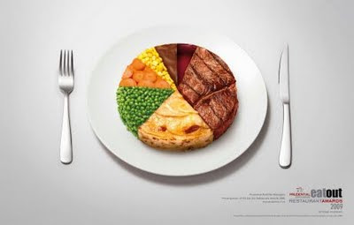
From Slides that Stick comes this image where a pie chart has the data represented with images instead of colors. This is an eye-catching and thought-provoking way to represent the data.

What if in the next budget meeting, there was a pie chart that had pictures of benevolence, missionaries, church buildings, and salaried staff? Would that affect how you budget? Would that help people to realize where their money is going?

How else can we creatively visualize things so as to make a point?

Monday, October 19, 2009

G.I. Joe!

Sometimes the picture says it all. What images can you use that need no words to explain? How can your sermons become more powerful without you speaking? Weird thought, I know, but sometimes it is better to let people work through things on their own and to let the pictures stimulate the thoughts.