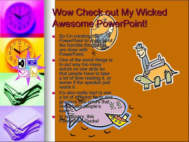
Over at Microsoft's very own PowerPoint blog they point out that wrapping words around an image is just a bad idea. Avoid it, they say. Use a document creator tool, they say. Keep PowerPoint simple, they say.
That's what everyone else has been saying all along. Get rid of the bullet points and the text and focus on communicating visually through the powerful medium that PowerPoint provides. An image with just a few words is all it takes to convey a powerful message.
I know that PowerPoint automatically generates bullet points when you start typing text into the pre-selected text field. I'm sorry. Don't use it. Don't give in. Each slide should, as a general rule, be one, large picture with no more than six words.
The example here is from a recent presentation that I completed. Notice that it says a lot with very few words. I let the image do most of the communication and the words just give a framework for the image to put it into some sort of context.
Even Microsoft understands that PowerPoint should be used more like this and less like this:


No comments:
Post a Comment