Find us on Google+
Showing posts with label photos. Show all posts

Friday, January 21, 2011

Photo Resources part 5 - Placement

So far this week we've looked at where to find good photos, how to search for them, selecting images with plenty of white-space, and editing images. Now we need to look at how you can place the images in your presentation.

You should almost always use a full-bleed image versus a framed image. Every time our eyes see a border they stop. The border acts as a barrier for our thoughts and causes us to differentiate. In the image on the left we see the image, then separately we see the words, then we may put them all together. The effect is very much like a high school year book with captions for photos.

In the images on the right we perceive the words connected to the image (and the white-space in the image gives plenty of room for the text). The effect is more professional, rather that looking like a high school kid's extra curricular activity it looks like a professional magazine layout.

When placing your image you want to expand the size so that it completely fills the presentation window. As you edit you may need to crop for white space. Notice that in the image on the left the subjects are centered in the frame of the picture (the picture is centered and the text is centered too). On the right, the subjects are off-center in the image to leave room for the text.

Perfectly balanced things make our eyes nervous for some reason. Photographers use the rule of thirds where major features in the photo fall along the lines one third of the way from the top, bottom, or sides and the subject of the image is placed at the intersection of two of those lines. When you crop and place your image, use the rule of thirds to provide a more professional look.

What tips do you have for placing images in a presentation?

Thursday, January 20, 2011

Photo Resources part 4 - Editing

Photo editing can be an overwhelming proposition at times. I know that I've opened up Adobe Photoshop
Learn how to make this at Photoshop Tutorials
and seen the "layers" and "Gaussian blur" and became overwhelmed pretty quickly. It's a powerful tool, but it also has a steep learning curve. If you want custom images that you can't find anywhere else, it will be worth your time to learn how to use Photoshop. Find some good tutorials that will help you swim in the deep end: Photoshop Tutorials has detailed steps for some very complex and fascinating photo manipulation projects. By the way, if you can't afford Photoshop right now, you can get a free open source photo editor that has nearly all the tools from Photoshop, called Paint.Net (it's what I use since I don't do a lot of heavy photo manipulation).

For more of the everyday photo editing tasks (cropping, straightening, removing red-eye, adjusting contrast, etc.) You have many of the feature you need right inside Microsoft PowerPoint
if you're running 2007 or later. You can also use free, online tools such as Picnik (Google has announced they are closing Picnik as of April 2012) or download Picasa to use on your computer. Both give you a simple interface for the basic features that you'll use most of the time as well as the option to get a little bit more detailed and controlled when adjusting things (looked for the "Advanced" button). These tools are generally better learned by just experimenting, they've been designed to be simple and easy to us. You won't get the stunning results of Photoshop, but you also don't have to put in the investment of time to learn it.

What do you use for photo editing?

(Note: links to products that cost money will earn me a small commission if you buy anything.)

Wednesday, January 19, 2011

Photo Resources part 3

White space is an important consideration when selecting an image. What's known as white space isn't necessarily white, but it is essentially empty. From a design perspective the empty space gives a chance for the eye to rest. It balances out the action and flow of the subject in the image.

If you choose an image overloaded with details you run the risk of turning your presentation into a game of "Where's Waldo" instead of keeping on track with your point. Your audience can absorb only so much information while still paying attention to you.


The white space in images is also ideal for putting text on your slides. When text is layered over a varied background, some of the letters can get lost due to poor contrast. If you have a good chunk of negative space that is all the same color you allow your text to pop on the image.

Monday, January 17, 2011

Photo Resources part 1

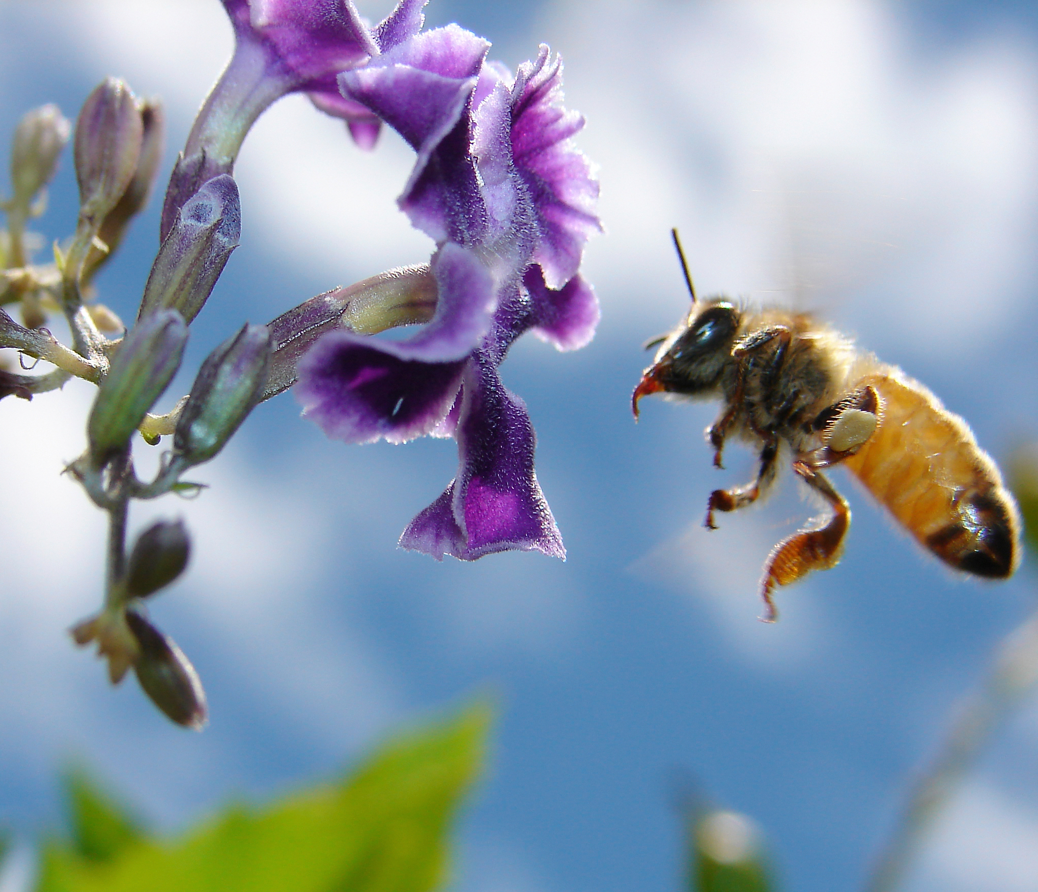
One fantastic photo resource is the Flickr Creative Commons group. The picture in this blog is from the creative commons area which provides copyrighted work that is free to use provided you attribute the work to the copyright owner (in this case aussiegall).

You can browse by keyword or search for different thing. I find that if I'm looking for something specific it can be difficult to find it with the Flickr organization system. I'm dependent on individuals tagging their photos in a way that makes sense to me. With Flickr I tend to browse through and look for photos that speak to me, or wow me in some way. I look for the emotional reaction caused by the picture. I may store up a bunch of these images before I find a use for them, but then I have them.

Make sure you look to see the specific copyright requirements for each image since some allow you to change the original work and some don't. All that is clearly spelled out at the main Creative Commons page as well as on each image.

When you find an image you like just click on the "Actions" button above the image then click "View All Sizes." Click the link for "Original Size" to the right then click the link next to "Download:" to save the file to your computer. I try to group my images by the project I'm working on, but you can choose a system that works best for you. Just organize them somehow otherwise you'll become overwhelmed after you've downloaded a couple hundred pictures.

What tips do you have for finding high quality images?

Thursday, November 04, 2010

Peace

Here I sit in the north park blocks of Portland. I'm surrounded by the noises of the city: construction, shouting, traffic, and leaf blowers. I feel peace here.

Where do you feel peace?
Published with Blogger-droid v1.6.4

Friday, February 19, 2010

Photo Gathering and Editing #5

Placing a Photo in a Presentation

Having a great photo is the first step, but now you need to put that photo into your presentation.

This is one place where the rules are just guidelines. If you spend some time looking at really good presentations you will see some trends emerge.

Use more images and less text. Have your images take up the whole slide or a great deal of the slide. For some reason PowerPoint thinks you should put your images in a frame within the slide. PowerPoint is wrong. You should expand your image so it fills the whole slide in most cases. Then if you need some text to explain what's going on - use just a few words.

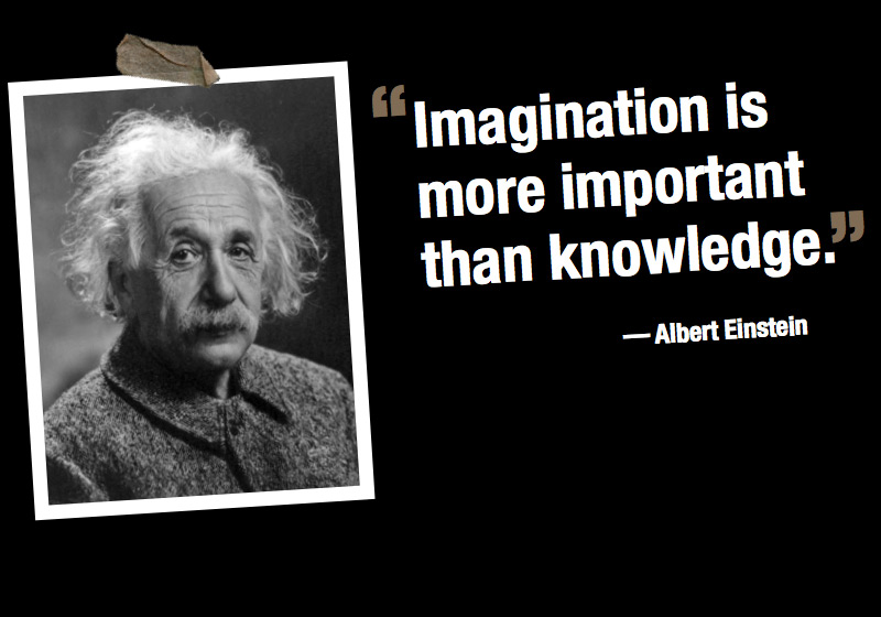
Quotes are a different case. When you quote it can be effective to have an image of the person being quoted and then the quote.

Basically, you should work to have your images speak for themselves as much as possible.

Thursday, February 18, 2010

Photo Gathering and Editing #4

How to Edit Photos

If anything is more difficult than taking good photos, it might be editing photos. It seems like there is a whole language about editing that is foreign and confusing. I must confess that I am quite the novice in editing, but I'm learning more all the time.

There are a lot of different things you can do with photo editing. Most of what you will need to do is pretty simple - crop, lighten, darken, or maybe delete an area. The good news is that stuff is available in free and easy software all over the place. You can do all that right inside PowerPoint 2007 (and word on the street is that 2010 is going to have even more options). So for the very basic stuff, don't stress, just grab a free piece of software (or do it in PowerPoint) and crop away.

But if you have something that you want that just doesn't exist with the photos that you've seen, you might want to look at doing some hardcore editing. I created a new logo for this site with some photo editing software called Paint.Net - it is powerful and free versus Photoshop which can be over $500 for the full version.

The key to learning to do more advanced photo editing is to take your time. Any good software will let you undo anything you do (as far back as you want to go).

I was able to take these two images and combine them into a logo for this site. It took me all afternoon and part of the next day, but I finally got it to where I like it.

I'll tell you more about that later, though.

Wednesday, February 17, 2010

Photo Gathering and Editing #3


Taking Good Photos

Taking good pictures is a difficult job. There's a reason that we pay professionals to take pictures for us - they have the time and training to think about lighting, framing, composition, f-stop, mega-pixels, and all the other photo-type-stuff involved in snapping great images.

But there are a few things you can do to snap some great shots of your own.

1. Lighting - there are a couple issues involved in lighting a picture well. First, think about the source of the light - is it behind your subject or in front of your subject? Usually it's a good idea to take a picture where your light is in front of your subject. Also think about the amount of light - a dark scene can be hard to see, but a flash might wash out the details. Some cameras have an intelligent mode that will detect a scene with difficult lighting and take two pictures, one with and one without the flash.

2. Composition - how is your picture framed in the shot? A well composed picture tends to rely on the rule of thirds. So a landscape will usually have the horizon in the bottom third or the top third. A portrait will have the subject in the left third, the middle third, or the right third. You might notice that good images aren't dead-center and balanced. They employ some imbalance for nice artistic effect.

In the picture of the mountain I framed the horizon of the sky in the top third and the edge of the meadow in the bottom third and the peak of the mountain in the right third. I think in turned out nicely.

3. Cropping - one of the best things about digital photography is that you can take a bunch of shots and not have to worry about wasting film and then when you get home you can fix any mistakes you made. Learning how to crop well can cover a multitude of photographic sins. You can fix your composition with a good crop or change a picture from a nice shot to a great shot.

One thing to consider when taking pictures that you might use in your presentations is that you want a descent amount of "white space" which just means empty space not filled up with something. In the pictures below you can see two crops - one emphasizes the flower, the other leave a lot of empty space. The second crop is a lot better for PowerPoint because it leaves you a lot more room to work with if you want to insert text.

Tuesday, February 16, 2010

Photo Gathering and Editing #2

On today's episode, we will look at how to find good photos online. This is something that I've covered a few times in the past, but it's important. In one of my first posts I highlighted the great list over at Presentation Zen, that gives links to several places to find photos online.

The problem is that it can be very difficult to find the right image for what you are trying to communicate. Just opening up Google Images to search is fine, but if you just type in 'Jesus' you are likely to have a hard time narrowing it down to the point you want to make.

In this case, using some good communication principles can be very helpful. The principles will help you to weed out the bad images and focus in on the good images.
1. Visual communication adds to your presentation. The adding can be emotional or informational, but your best bet is to stick to the emotional side of things. The important thing here is that your image should say the same thing as your words, but in a different way. Maybe your words are a exegeting the text - your image can be a metaphor for your point. Ask yourself: what image will add emotion to the point that I'm trying to make?

2. Images should dwell in the cognitive gap that lies between the speed of speaking and the speed of thinking. Images need to offer people something to think about while you are speaking that will point them back to what you are saying. In the past people dealt with this gap by taking notes or reading the bible passage in question, but now very few people do that. It's important to not distract with an image - if you do, then they will think about something other than your sermon. Ask yourself: where is my point coming from and where is it going? You can use images to get people thinking toward your next point.

3. Less is more. Often I'm tempted to try and do too much with my pictures. I want to illustrate every point and highlight every nuance of the sermon. But if I do that I end up overloading the church and overworking myself. Too much information will lead to poor communication just as too little will. I typically have three to five images in my sermon. Sometimes I will use a blank slide in between to bring the focus back to what I'm saying. Ask yourself: what are the most important points in my sermon?

I know this doesn't make it simple to find the perfect image, but with these principles you can do a much better job of communicating the message with power and imagination.

Monday, February 15, 2010

Photo Gathering and Editing #1

This week I want to look at all of the things involved in putting together high quality photos for your presentations. This is an incredibly important part of creating a powerful message through the visual medium.

I want to look at how to get good photos, how to take good photos, how to edit good photos and how to place them in a presentation.

Before we get started, though, are there any questions you have? What do you need to learn about using photos well?

Thursday, December 31, 2009

Should Old Acquaintance Be Forgot?

The traditional song "Auld Lang Syne" poses the question: "Should old acquaintance be forgot and never brought to mind?" The weird thing is that usually that's all we know from the song - then we just sing "Auld Lang Syne" ad nauseum.

Guess what? The answer to the question is: No. No, you should not forget your old acquaintances. The rest of the song is all about reminiscing and remembering the old days while sharing a drink with friends. Forgetting is not the goal, but remembering and celebrating the memories made together.

Perhaps it would be good to have a service where you spend time remembering the previous year. Reflecting on the memories you made together and the connection you share. One cool thing that I've seen is a year in review slide show where all the events of the year are set to music and shown to the church. This is a great way to share and celebrate everything that's happened over the year.

A few notes:
  • Be aware of the time this can take - if you have a 15 minute slideshow you'll need to cut something out of the service.
  • The larger your church the earlier you will have to start on this - it takes a long time to get photos from everyone.
  • Make sure to include photos from as many groups as you possibly can.
  • This doesn't have to happen in December - if you do this at the end of January it's still ok.