Trust And Obey
View more presentations from James Wood.

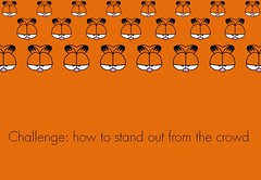
Technology for presenting the good news


 John starts his first letter like this:
1That which was from the beginning, which we have heard, which we have seen with our eyes, which we have looked at and our hands have touched—this we proclaim concerning the Word of life. 2The life appeared; we have seen it and testify to it, and we proclaim to you the eternal life, which was with the Father and has appeared to us. 3We proclaim to you what we have seen and heard, so that you also may have fellowship with us. And our fellowship is with the Father and with his Son, Jesus Christ. (1 John 1:1-3)
 "The Surround Sound Effect" is the name that I have given to technology that can interfere with its purpose.
 My friend Mick pointed me to an online presentation creator called Prezi that does some really cool zooming and turning effects to give motion and drama to a presentation.
 Of the most important resources for putting together a great presentation, I think the most neglected is pen-and-paper.
 Today it's time for some healthy discussion. What questions do you have about PowerPoint, video, MediaShout, EasyWorship, podcasting, or anything else?
 570 years ago Johannes Gutenberg changed the world. With the release of his closely guarded secret, movable type printing came to Europe for the first time. Since then every aspect of our communication has changed.
Ten years ago, you had a wide range of excuses for being a lousy visuals person. Starting with no talent, leading to no skill and going from there.
But now, in a world where it is expected that professionals will be able to make beautiful powerpoint slides, handsome business cards, clever bio photos and a decent website, it's as important as driving. And easier to learn and do, and requiring less talent.
No, you and I will never be gifted designers or breakthrough designers. But there's really no reason not to be really good.
What I discovered was when the brain receives sensory inputs, it transforms them into images. In other words, the brain learns, adapts, and is literally re-wired through images . . . We need to communicate in images. Whether it is video clips, or images in our sermon or verbal images, if we want to communicate for behavioral change, we need to communicate in images.
I think the use of video and drama largely is a token of unbelief in the power of preaching. And I think that, to the degree that pastors begin to supplement their preaching with this entertaining spice to help people stay with them and be moved and get helped, it's going to backfire.... It's going to communicate that preaching is weak, preaching doesn't save, preaching doesn't hold, but entertainment does.
 The Conference Table Effect is a term I use to describe what happens when an idea is discussed too long by the same people with no outside input or critique.
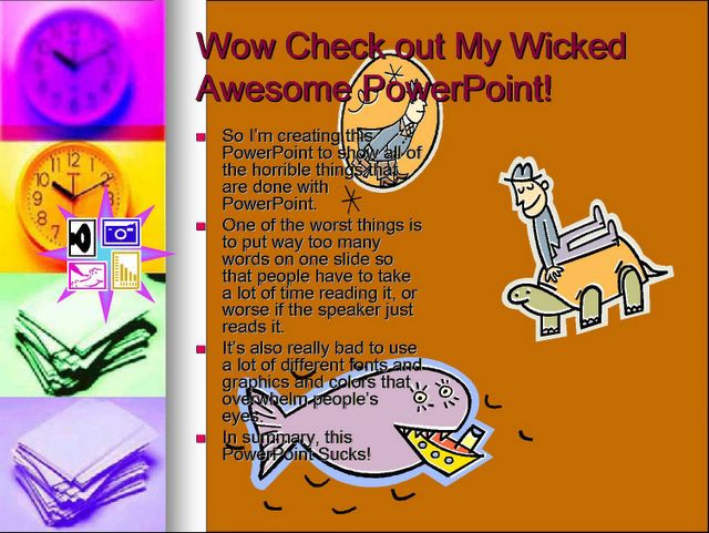
 Ok, first of all, I just have to say that I love the visual that went along with this article - I had to bring it over to share.
The researchers determined that the subjects who used their phones more frequently, especially for predictive texting (the services that automatically complete words), finished tests sooner than other subjects, but with more incorrect answers. Researcher and epidemiology professor Michael Abramson told ABC Science that predictive texting is "training kids to be fast but inaccurate." He went on to explain, "If you're used to... entering a couple of letters and getting the word you want, you expect [the world] to be like that."So, what does this have to do with PowerPoint in preaching? Well, I have heard similar claims about the projection of Scripture, that it makes people too stupid to use their bibles. Or that when we project images of our examples that it prevents people from using their own imaginations (therefore making them dumber).
 "I have become all things to all men so that by all possible means I might save some." 1 Cor. 9:22
 Our brains are designed to pay attention to the important things and to ignore the boring things, says John Medina's Brain Rules.
The 10-minute attention spanAfter an amount of time disappointing to teachers and PowerPoint presenters everywhere, audience attention drops precipitously.You must do something emotionally relevant at each 10-minute mark to regain attention.
 Video Clips in PowerPoint:
 Edward Tufte wrote an article for Wired a while back (here) in which he talks about how awful PowerPoint can be.
Imagine a widely used and expensive prescription drug that promised to make us beautiful but didn't. Instead the drug had frequent, serious side effects: It induced stupidity, turned everyone into bores, wasted time, and degraded the quality and credibility of communication. These side effects would rightly lead to a worldwide product recall.
Edward R. Tufte is professor emeritus of political science, computer science and statistics, and graphic design at Yale. His new monograph, The Cognitive Style of PowerPoint, is available from Graphics Press (www.edwardtufte.com).


When you search for photos by keyword on Flickr, you get a grid of thumbnails, each of which pops up full-sized versions in-page. (No more having to click to a new page to see what the image looks like close up and other stats.) You can set how big the thumbnails should be, and also sort results by Flickr's magical (and very useful) "Interestingness" rank.
To find Creative Commons-licensed photos only you still have to click on the "Advanced Search" link; but you can bypass that step with a little URL hacking. Append
&l=ccto your search keyword shortcut to limit Flickr results to re-publishable images. Firefox keyword bookmark users: the full Flickr CC image search bookmark URL should behttp://www.flickr.com/search/?q=%s&l=cc. (Use&l=commderivfor images licensed for commercial use and derivative works.)
As digital cameras have become ubiquitous, and cheap (or free) photo websites plentiful, more people than ever are using images in presentations. Images are not appropriate for every kind of talk, but even when images are appropriate (such as keynote/ballroom style presentations), people are still making the same common mistakes. So here are some things to keep in mind if you use images in your next talk
1. Image is too small
4. Image is of poor quality
6. Image is stretched horizontally and distorted
9. Clip art is chosen (see above)
10. Image is lame and and has nothing to do with content

