
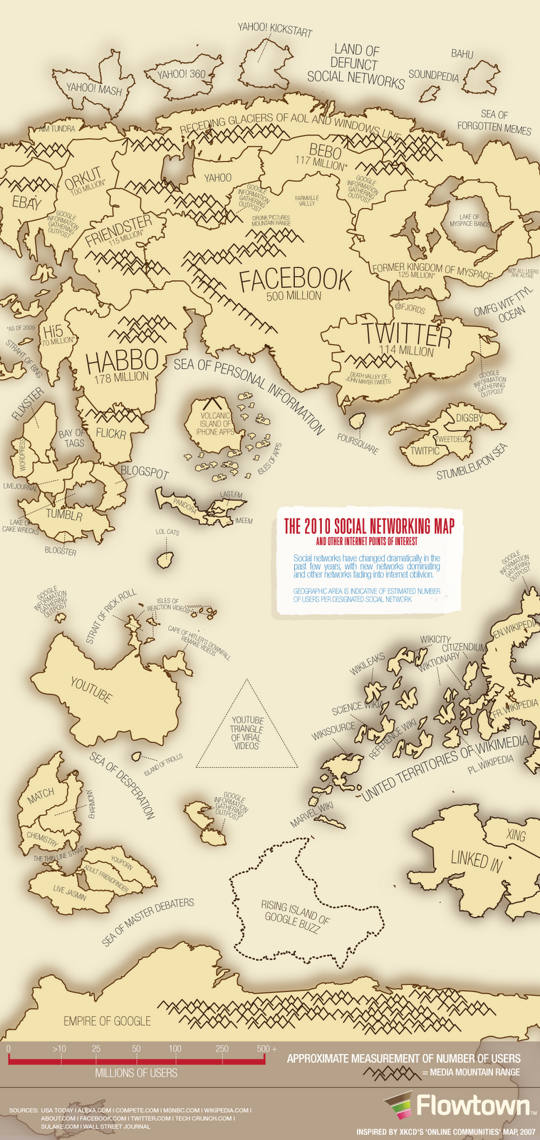
This is an absolutely fascinating image - it shows the number of users for different social media platforms as the size of countries on a map. Click the link above for the full size splendor.
Facebook is smack in the middle with the largest population, that's no surprise. But I am surprised by Habbo, which I had never heard of before seeing this map. I love the way that the old social networks are fading away as the frontier moves on.
This is a fantastic example of how data can be conveyed using images for powerful effect. If I just put up the numbers you would see a few things, but you wouldn't notice the relationship between the blogging sites (around the Bay of Tags) or the vast expanse of wikis online.
No comments:
Post a Comment